At this step, you already have some ideas in mind and can visualize what types of menus you will need—whether it’s a sticky menu (which stays pinned on the screen when scrolling up or down the website) or a section menu (which moves along with the screen when scrolling up or down the website). The next step is to determine which type of menu you will implement first:
Tip: In most cases, you should start with a bottom bar menu for mobile. This will be the right choice for 90% of websites, as it is one of the best practices for mobile user experience.
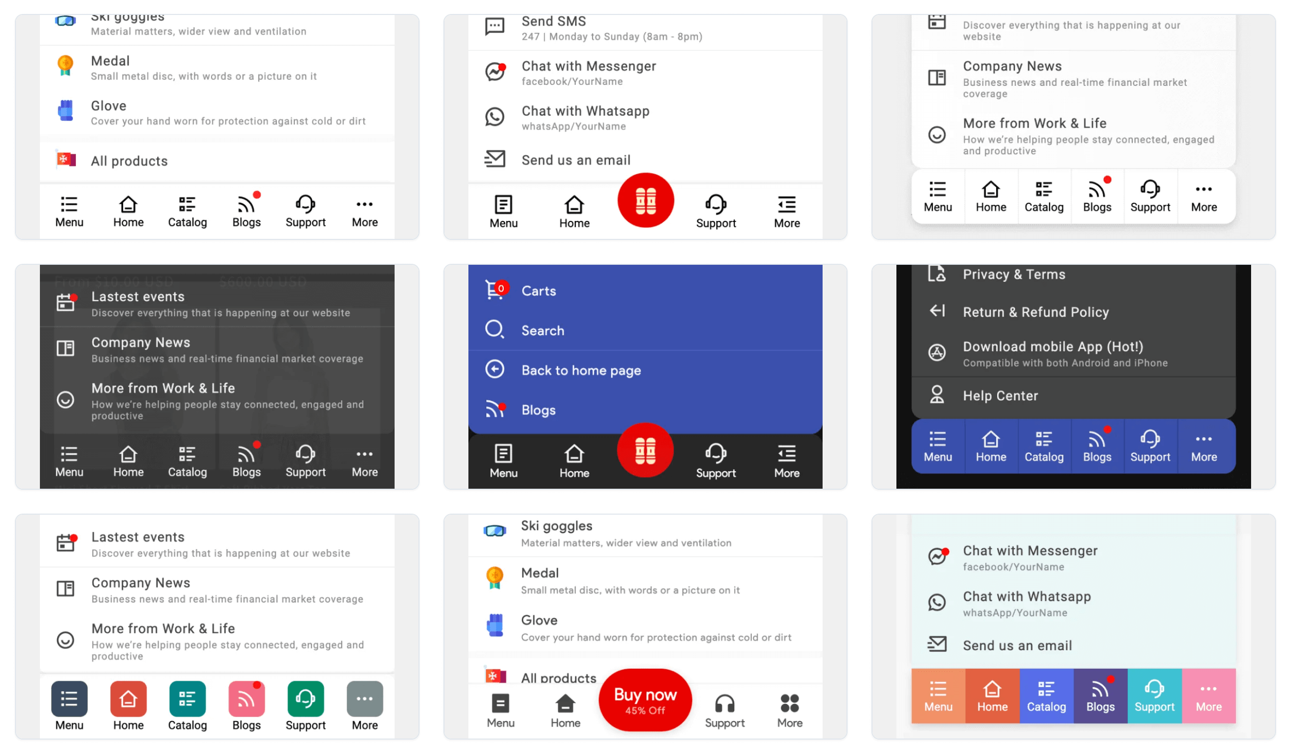
1. Bottom bar: Extremely optimized and essential for mobile.
Definition of Bottom Bar:
The Bottom bar (sometimes referred to as the Tab bar, Nav bar, or Bottom navigation) allows movement between primary destinations in an app. The Bottom bar lets users switch between UI views on smaller devices.
View details: https://m3.material.io/components/navigation-bar/overview

1.1. What are the pros and cons of using a Bottom Bar on your website?
Pros of bottom navigation bar
One of the main advantages of using a bottom navigation bar is that it is easy to reach and operate with one hand, especially on large-screen devices. This enhances the usability and accessibility of your app, as users can switch between the core sections of your app without stretching their fingers or changing their grip. Another benefit of using a bottom navigation bar is that it provides clear and consistent navigation cues, as users can always see the current and available options. This reduces confusion and cognitive load, and helps users form a mental model of your app’s structure and functionality.
Cons of Bottom Bar
Despite its benefits, using a bottom navigation bar also has some disadvantages and challenges that you should be aware of. One of the main drawbacks is that it takes up valuable screen space, which can limit the amount of content and information you can display on your app. This can also create visual clutter and distraction, especially if you use too many icons or labels on your bottom navigation bar. Another challenge is that it can conflict with other UI elements, such as floating action buttons, swipe gestures, or system navigation controls. This can cause accidental taps, navigation errors, or inconsistency across different devices and platforms.
Tips for designing Bottom Bar
To optimize the performance of your bottom navigation bar, it is important to follow some design guidelines and best practices. Limit the number of items to five, and prioritize the most important and frequently used features of your app. Use icons and labels that are clear, concise, and recognizable. Utilize color, animation, or feedback to indicate the active and inactive states of your bottom navigation items, while providing a smooth transition between them. Additionally, ensure that your bottom navigation bar is not placed on top of other UI elements such as keyboards or dialogs by adjusting its position or visibility. Lastly, test your bottom navigation bar on different devices and platforms to ensure compatibility with system navigation controls and gestures.
1.2. When is it appropriate to use a Bottom Bar?
The Bottom Bar is suitable for all mobile websites and mobile apps, especially in today’s era where large smartphones are becoming a trend. The ability to navigate a screen with one hand is very important, which is why older menu experiences like the Hamburger menu have gradually become outdated and less favored. On iPads and desktops, the Bottom Bar is sometimes also used as a primary navigation menu, providing customers with a more consistent and easier experience.
1.3. How does Navi+ support the creation of a Bottom Bar?
Navi+ supports a variety of Bottom Bar styles, offering different templates that allow you to choose, configure, and easily modify them to fit the style and goals of your website. You can create a Bottom Bar with up to 3 levels of menus, change colors, fonts, upload images, change icons, add animations, and enhance the overall experience. According to Shopify’s reviews, Navi+ is currently the best Bottom Bar creation tool on their marketplace.
See all demos: https://naviplus.app/demo/index.php?page=case-study
2. Grid Menu: Excellent for navigation, especially for displaying categories and hot products.
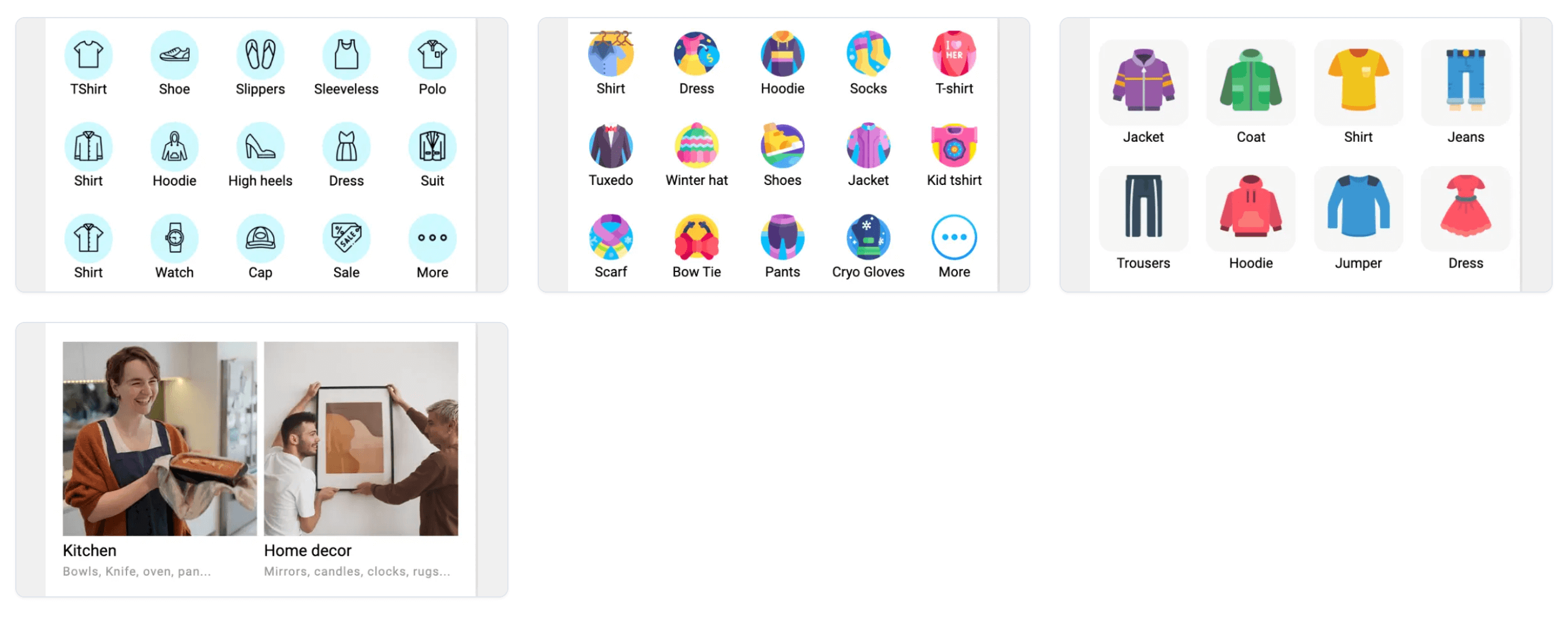
A grid menu is a type of menu interface that displays options in a grid-like layout, rather than a traditional vertical or horizontal list. It allows the user to browse and select from multiple categories or groupings of items at once.

2.1. When is it appropriate to use a Grid Menu?
For any website, the product categories are typically something you want to show to customers first. A category can have many products and may include subcategories, but a category will feature a name and a representative image—usually an attractive and iconic photo.
For example, if you have a website selling sports equipment (like Decathlon), here are some categories you might consider:
Swimming:
- Swimwear
- Goggles
- Swimming accessories
Running:
- Running shoes
- Apparel (Men and Women)
- Watches and accessories
How can you show customers that your website includes major categories like these? Sometimes, you can incorporate them into the Bottom Bar, and this is actually a very good idea. Check out the following case studies and see how Chocoladna.com uses the Bottom Bar to display categories. However, the Grid menu is a very popular and optimized option for this case. You can add a Grid Menu to your homepage or catalog, featuring one or more sections, with a representative image and category name, arranged in a grid of 3, 4, or 5 items depending on the resolution of the image you want to showcase.
Did you know that all major e-commerce websites such as Amazon.com, Alibaba.com, Shein.com, Taobao.com, Shopee.com use a Grid Menu on their homepage? The larger the business, the more products, and the richer the categories… the more important the Grid Menu becomes.
2.2. How does Navi+ support the creation of a Grid Menu?
Navi+ makes it easy and intuitive to create a Grid Menu. You can create menus in a 3, 4, or 5-grid format depending on the size of the representative images and the length of the category names. You can add images, icons, and configure the category interface according to your needs, and modify it at any time. You can also measure the usage of this Grid Menu and update it over time without needing to know any code.
3. FAB (float action button), Support bar

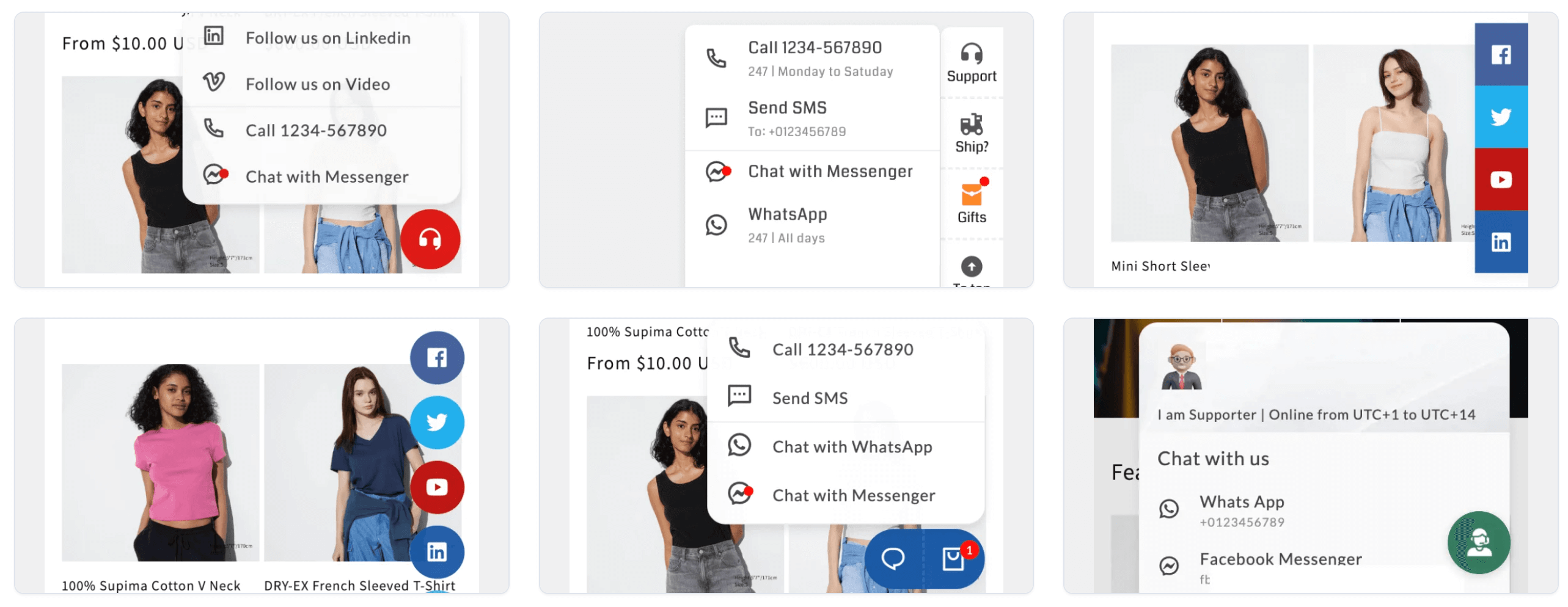
A floating action button (FAB) performs the primary, or most common, action on a screen. It appears in front of all screen content, typically as a circular shape with an icon in its center. FABs come in three types: regular, mini, and extended.on, action on a screen. It appears in front of all screen content, typically as a circular shape with an icon in its center. FABs come in three types: regular, mini, and extended.
3.1. When is it appropriate to use a FAB
On all e-commerce websites, a FAB (Floating Action Button) is indispensable. You will see them used frequently—and sometimes overused—covering a lot of information on your website. The following example will clarify this:
An e-commerce website may need a FAB to allow customers to chat with you when they require support or want to ask more about products and sales policies. In this case, you can use various tools to do this, such as free tools like WhatsApp, Shopify Inbox, or paid ones like Crisp, Tidio, etc. Whether free or paid, you will need a FAB, which is a floating circle on your website, allowing customers to click it anytime. This circle does not disappear when customers scroll up and down the screen, sometimes covering important information on your site.
An e-commerce website will need some loyalty features to keep customers engaged. Tools like Smile.io, Rivo, etc., can help with this. The job of these applications is to incentivize customers to leave their personal information, such as email and phone number, when they visit the website or click the FAB on the screen, allowing you to follow up for future sales. This will also require a floating FAB on your website.
An e-commerce website may include additional features such as leaving feedback, reviews to enhance virality, screen sharing, link sharing, etc. Your marketing team, SEO team, sales team, and more will all need a FAB on your website. On a desktop with a wide screen, this isn’t much of an issue, but on mobile, it becomes a real nightmare.
At this point, you need to find a solution, and Navi+ will help you with that.
3.2. How does Navi+ support the creation of a FAB
- Navi+ helps you create FABs for support completely free of charge, with chat tools like WhatsApp, Line, Messenger… You will save $20-50 per month on licenses for integrated chat tools. Special feature: Navi+ is deeply integrated with Shopify Inbox for free, allowing you to use this powerful chat tool without blocking customer space or important information.
- Navi+ helps you create FABs for sharing and virality: screen sharing, links to social media, and sharing with friends.
- Special feature: Navi+ allows you to combine multiple FABs into a single circle (see how Navi+ is used in the product’s backend), saving space for your customers and ensuring that important information is not obscured.
4. Mega menu: Add more or Completely replace the header (for both mobile and desktop).


What is Mega menu? A Mega Menu is an expandable menu that displays navigation options to site visitors in a large, rectangular group. This option replaces scrolling and using icons, tooltips, and typography to explain user choices.
4.1. When is it appropriate to use a Mega menu
By default, you won’t have a Mega Menu with your theme. Free themes like Dawn, Craft, etc., from Shopify provide a very simple header and a dropdown menu with just one level. How can you create a menu with various features such as adding images, multiple groups, important news and articles, and arranging items horizontally or vertically? With premium themes, you might get a Mega Menu, but it can be quite difficult to use. In some cases, you can install Mega Menu apps from the Shopify Marketplace, but they are typically designed as Desktop first + Mobile friendly. With Navi+, you get a truly Mobile-first app that supports Mega Menus, with powerful and easy-to-use tools to create a large menu.
Although Navi+ recommends using the Bottom Bar as a Mega Menu—bringing the entire experience, categories, news, and articles to your Bottom Bar for easy access near your customer’s fingertips—you can still use Navi+ Mega Menus on desktop and even on mobile.
In some cases, you may need to replace the entire theme header with Navi+ templates, but this is very easy and quick. Many Navi+ customers have done so and achieved great success.
Check out the following example to learn more: https://www.youtube.com/watch?v=n4ITAvazJ-4
4.2. How does Navi+ support the creation of a Mega Menu
- Navi+ supports creating 2 types of Mega Menus: one is an “Add-on Menu,” which is a type of menu located just below the header that does not completely replace the header. This menu enhances the header with a rich and diverse selection of features: 3 levels of menus, images, news articles, horizontal arrangements, etc.
- Navi+ also supports creating a menu that completely replaces the theme’s header. In this case, you will need to hide the old header and use the new header from Navi+, with flexible configuration for both design and architecture.
- Navi+ supports both mobile and desktop. For desktop: You can configure the menu to open sub-menus on mouse hover, with multiple levels of menus and horizontal arrangements.
5. Banner.
Why do you need a banner? A banner is one of the simplest and most effective ways to grab attention. With just a beautifully designed image (you can use canvas.com), it can effectively capture users’ attention.
Banners are very popular on websites and are one of the most important navigation elements. With banners, you can freely showcase different designs with beautiful images, unique fonts, and attractive colors. Of course, you need some tools to create banners, such as Photoshop or Canva. With Navi+, we provide ways to easily add banners with various size configurations. While banners may not be a standout feature that Navi+ emphasizes compared to other applications, they are an essential piece of the navigation toolkit in line with the All-In-One philosophy.
